รีวิวโครงการ
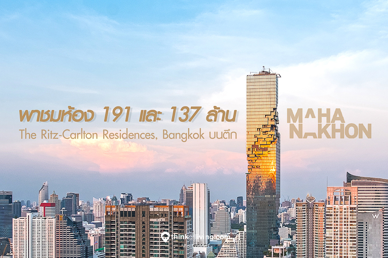
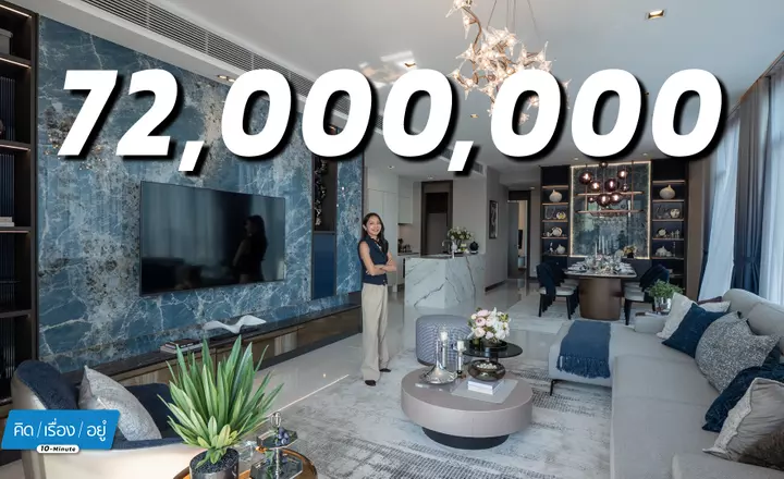
พาชมห้อง 191 และ 137 ล้าน ของ The Ritz-Carlton Residences, Bangkok บนตึก “มหานคร” [รีวิวย่อฉบับที่ 1507]
30 ธันวาคม 2017

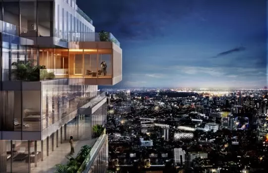
The Ritz-Carlton Residences, Bangkok – Part II (Click here for part I). This time we will take a look at the unit in the picture above, calling “Simplex Sky Residence” which was designed to make it seems like the room is “floating” in the sky, taking a 270 degree view. This unit has an area of 430 sq.m.
Fact @ 22 November 2012
- The Ritz-Carlton Residences, Bangkok (Click here for the part one of the project review)
- PACE Development Corporation Plc.
- ULTIMATE LUXURY CLASS (Click here for details of condo segment )
- High-rise, 77 storeys, 1 building, residential units of 194 units are located on 23rd – 73rd floor.
- Fixed parking space from minimum of 2 cars + Valet Parking
- Estimated total area 9 Rai or 3.55 acres.
- 2-5 Bedrooms / Simplex / Duplex
- Available spaces 120 – 850 sq.m.
- Estimate starting price of 32 million baht.
- Estimate starting price per sq.m. of 220,000 Baht
- www.rcr-bangkok.com
Just by clicking LIKE, you can show your support for in-depth reviews from ThinkOfLiving.
Sky Residence Walkthrough
For those who haven’t checked out the first part of our review of The Ritz-Carlton Residences, Bangkok, you can do it by clicking here, and we highly suggest you to read the first part first.
An elevator in the hallway of the sample unit. The frame is made of color-dyed real wood. It is wide enough to allow wheelchairs to travel conveniently.
Simplex Sky Residence is a contemporary classic style condominium with an area of 430 sq.m.
A hard wooden pattern door with very tall height
The room number.
A classic handle with a wooden cover.
After entering, you will see a grand-looking hall with spiral pattern floor, a chandelier and the arch sliding doors.
The flooring material is made from Italian imported marble. Let’s have a look at the conceal door on the side before continuing down to the hall.
This is the maid’s room. To provide best privacy to the home owner, this room is like a shortcut for maids and service staff to access the kitchen and laundry without having to pass through the main corridor.
The maid’s area floor uses ceramic tiles. The wall is plainly white-painted.
On the opposite side of the maid entrance is a storage closet. These doors are made with color-dyed wood with stainless steel trimming.
Entering the Residence, the lobby has the circular-shaped foyer with custom-made sliding doors.
The chandelier is custom designed. The ceiling has different levels with ring-shaped lighting.
Entering through the sliding door covered with stingray skin leather, you will find a working room.
The working room is organized with very large spaces comparable to one entire bedroom.
The furniture is placed broadly. There is a big working table, a sofa for watching TV and for guests, and an armchair for reading.
A look at the room’s furniture and space overall.
The floor is made of real collated solid oak similar to that of the 2 bedrooms but with lighter color. This lighter tone is what we prefered in our opinion.
The doors are covered with stingray skin leather. The handle is hammered metal.
The top of the working table is made of wood. All the drawers’ handles are made with genuine leather. The chair is also covered with genuine leather and can be rotated.
The curtain and its rail.
The ceiling frame is carved at around 60 degrees which allows beautiful light reflection.
Air conditioning system is hidden in the ceiling using a VRV system.
The lamp hanging from the top, illuminating the bookcase
When you work with the doors closed, you’ll get a classic atmosphere like this.
Leaving from the working room, we now turn left to the living quarters.
There are footlights installed along the hallway for walking during night time.
Universal electrical sockets from Clipsal.
The lamps on the side have a prism-shaped bar in the middle which is quite nice.
Entering through the double doors into the living room.
Along the hall, paintings with frames are placed as decoration at the ends of the hallway.
On the side of the hallway is the guest bathroom. It is beautifully decorated with a design of butterflies and trees on wallpaper. This was not done with prints but was embroidered with threads.
The sink and faucet from Lefroy Brooks.
The faucet provides a mixture of hot and cold water. Its piping system is embedded inside the wall.
Legs and space for putting toiletry supplies under the sink.
Roll for tissue paper.
Toilet has its tank installed inside the wall.
A uniquely designed wall lamp
The wallpaper decoration goes all the way up to the ceiling, which makes it looks like tree branches falling from above.
Let’s leave the bathroom and take a look at the overall image of the living room which holds three different parties within the space.
Marble pattern, wooden floor and the carpet.
Lighting control from Clipsal.
The handles of the door to living room
The lights have a dimming system that allows full adjustment of their brightness, not just turning them on/off.
The first corner has a light blue and yellow tone. The floor rug pattern is custom made. The curtains are handmade products from Pasaya. The painting in the back fits in nicely with sofa and chairs.
The two cabinets on the side also have a design that fits with the color theme.
Blue sofa with golden legs.
This furniture behind the sofa is also nice. It’s a marble table with cool looking legs for placing a lamp.
The curtains from Pasaya, which its pattern was custom-made only for this room.
This area is the second zone where guests can sit down and have conversation in the middle of the room.
Note the legs of this table.
Its top is made of bamboo.
Seating around the fireplace.
The fireplace is covered with marble with decorative firewood inside. There’s no heating system here. (It is surely unnecessary in Bangkok.)
Finally, the third party area is a grand sofa set next to the garden.
Outside is a terrace which can be accessed from the living room as well as the kitchen.
The fabric used for this sofa is quite nice and soft.
A three-legged table
The table in the middle is made with stingray skin.
A long blue sofa
The side table is a marble table.
This table is stylish. It has separated pieces.
You can freely move it to personally use for placing your own drink.
This picture is for showing the design pattern of the pillows.
Another view of the living room
Now, we’ve come to the favorite corner of this project.
The sliding doors accessing to the dining room, set in the skybox pixel
The look of the room in the skybox.
The floor and the carpet have matching colors with the sliding windows
On the window panels, it can be seen that the decoration is not done with paint but by stitching threads with two different colors.
Dining table and chairs.
Eight people can sit and enjoy their meal comfortably.
After opening the doors to the skybox to show the outside scenery
We’ll get a room like this. Try to imagine that this room is on 50th floor…
It provides a 270 degree view. You can feel like you are floating in the sky while you’re eating.
The window frame extends from floor to ceiling, providing glass of 3.4 meter tall
Zoom in for a clear look at the wooden floor.
Let’s walk to the other side. This area is a terrace which is arranged to be a garden area for outdoor seating and conversation.
The terrace is divided into two parts, the previous outdoor seating area and the area with round table. The latter is suitable for having coffee and snacks or eating outdoor as this area is connected to the kitchen.
The floor is made of genuine wood and artificial grass.
Fitting work and doorframe.
Notice that the window’s bottom frame seamlessly connects with floor at the same level, so you won’t stumble on it, and this allows a “taller” viewing angle
Next, we go take a look at the kitchen.
The kitchen has a luxurious arrangement. There is an area of counter bar and a corner for 4 seats. The floor is made of imported marble.
There’s another sofa, which connects to the outdoor dining area at the terrace.
This table can be moved like this to place small drinks or snacks.
The sofa connects to the outdoor dining space like this.
Let’s now look at the island counter on the part of bar/pantry.
Prism bar lamp
The counter is created from a combination of two marbles with white and black color each.
Rotating bar stool.
This equipment is from Poggen Pohl. The trashcan can be pulled out like this.
A sink from Franke
The faucet with classic style.
A wine fridge with adjustable temperature
Electric hob from GAGGENAU
Kitchen set from Poggen Pohl.
Kitchen drawers and handles
The gimmick here is the marble pattern in which white marble with black pattern and black marble with white pattern are combined to create contrast.
The cooker hood and lights are installed under the marble.
This door is…
The refrigerator. Above it is four spaces for dry food.
From GAGGENAU
The wallpaper and small dining corner
The pattern was created from carving the wood then painted the carved area with white paint.
Beautiful chair.
Continue with the electric equipment.
Microwave is above and oven is below, both are GAGGENAU branded
There’s also air conditioner here.
The door to the hall in the front. This is similar to a back door. It is also the second way of entry/exit for services.
Open it and you’ll find the service access area.
There’s a separate sink for dish washing.
Washing and drying machines. The top counter is made of marble.
Marble is also used on threshold.
Most doors in this project are sliding type.
They can be opened all the way. This is how you pull out the recessed handle.
This service room is connected with the hallway.
A bathroom for maids
Lights in the kitchen also use the automate scenery setting system which has a wireless remote that can be pulled out.
Back again to the main hall. Now we’re heading to the bedroom quarter on the opposite of the living quarters.
There’s a large round mirror decorated at the center of the wall
Walking into the master bedroom, you’ll find an area like a personal corridor. On the left side is the master dressing room while on the right side is the master bathroom. Let’s take a look at each one.
On the left side is the master dressing room, which is spacious for its size
A full body mirror that can be rotated.
The electrical system in this room will turn on by itself because there’s a sensor at the door. This allows anyone with wet hands to enter this room without touching the light switches.
The walk-in closet built by Poliform.
Two armchairs that can be arranged in different directions
Now let’s continue on the opposite side. Opening the sliding doors.
You’ll find a master bedroom which its size is similar to a single typical studio-type condominium.
The bathtub in the middle is the most outstanding feature.
A bench that wraps around the tub.
The black part below on the floor is made of small marble put together to prevent a slippery surface.
The other side has a shelf like this and the area for resting your neck in the tub.
Faucet and shower.
The sink corner, featuring dual sinks for his and hers
This is a storage cabinet for bathroom equipment and supplies.
Faucet and sink from Lefroy Brooks.
The lamps covered with transparent materials that look like quartz crystal
The mirror in the middle also opens up for storing toiletries.
Drawers and towels
An electrical socket is available.
This is for showing the pattern of marble.
This room is the enclosed toilet.
A golden handle and a tempered glass door
Tissue Paper Roll holder
A look at the shower set, which have both rain and hand shower types.
Zooming in for better details of the rock finishing, which are collated piece by piece.
Shower from LB has a classic and luxurious look.
Rain Shower
Lights are hidden above in the back.
The threshold of the shower room is a marble as well
The area for shower equipment is also made of marble.
This master bedroom has large windows. The view must be wonderful if looking from a high floor.
This is the door to the master bedroom.
The area inside the master bedroom is arranged like a suite in which a lounge corner is also integrated inside the bedroom.
The lounge corner can place a sofa set of five seats like this.
Bed is on the other side.
The sofa corner for watching TV
The design of the light from the two lamps on the side is very beautiful.
The table is made with light green rock which fits in with the room’s color theme of green-white.
A classic dressing table.
A dark green sofa for lying down and reading.
This table is made of stingray skin.
When you open the curtain, the room can be filled with natural lights from multiple directions
There’s a switch at the headboard that can control all the lights in the room. You can easily reach from the bed to use it.
Let’s now take a look at the second bedroom.
This room is decorated in purple tone.
A walk-in closet is located as we enter the 2nd bedroom
Again, there’s a sensor system for automatic light.
The bathroom in the second bedroom is similar to that of the master bedroom but with smaller size.
The tone of decoration changes from gold to silver for this bathroom, which gives a different modern look.
Two separated sinks as His & Her type.
Shelf above the sink.
Inside the shelf, there’s a electrical socket ready.
The drawers under the sink
The bathroom has a quite spacious area, which is convenient to use.
The bathtub and the faucet on the outside.
The air conditioner in the bathroom.
Toilet room.
The floor in the shower room.
This shower also has tiles laid from floor up to the top, which prevent water from splashing the ceiling.
The faucet has the same design as that of the master bedroom, but it’s in silver.
The second bedroom is simply decorated in purple tone. There are two sofas for watching TV. Two stools are also available to use for resting feet and can be combined with the sofas.
The bed and the lighting design.
A useful multi-tasked bedside table.
The distance for watching TV. The TV is large enough and shouldn’t be larger than this.
These two armchairs can be freely rotated.
This is the end of our review of the sky residence.
Price and conditions @25/11/2012
- A 430 sq.m. Sky Residence with 2 or 3 bedrooms starts at approximately 140 million baht. (Most units have a different layout because the building was designed to have floors and units with different dimensions under the Pixels concept.)
- Approximated 99-year leasehold contract. The contract is renewed every 30 years in 99 years. There are extra expenses when the contract expires.
- Fully Fitted.
- Wardrobe from Poliform. Order with custom made.
- Kitchen from Poggen Pohl with electrical appliances from GAGGENAU and SIEMENS.
- Residential facility fee of 120 baht per sq.m. per month.
In-depth: Summary
This concludes the two sample rooms of The Ritz-Carlton Residences, Bangkok, the two-bedroom type (in part I of this article) and the sky simplex residence. Apparently, this project is highly luxurious as expected of a project from a world-class hotel group like The Marriott. Within the MahaNakhon mixed-use development, there’s also The Edition hotel which is the boutique hotel concept managed by The Ritz-Carlton for short-term travellers. The services and facilities of this hotel also provide convenience for the residents of The Ritz-Carlton Residences, Bangkok, although the facilities areas are separate. However, it is best to keep in mind that, in the same area of this project, you can actually buy a freehold residence instead of 99-years leasing like this one.
So now that we’ve posted two reviews for The Ritz-Carlton Residences, Bangkok and the MahaNahkon project, some might wonder whether we are finished with this series. The answer is no. Because the building is still under construction, we haven’t seen the real completed project and we plan to continue updating for this development , which will be a landmark for Bangkok.
If you find this review useful, please click LIKE to give your support so we can have encouragement to continue with more reviews.
